Online store for the MYCH brand
Share with AI:
This is a Ukrainian functional art brand that hand-crafts unique objects and interior solutions from natural materials, embodying the philosophy of quiet luxury. Their works add aesthetics and a special mood to the space, turning into heirloom objects that are passed down from generation to generation.
View websiteAbout the project
MYCH is a Ukrainian object design brand that combines form, texture, and meaning. Our task was to create a website that would not just show objects, but convey the brand's aesthetics, its materiality, and the idea of "quiet luxury.".
We aimed to make the digital space a continuation of the MYCH philosophy: minimalist, light, with an emphasis on objects and expressive photography. The site became not a catalog, but an interface that establishes a direct emotional connection with the brand.
In our work, we focused on a clear structure, smooth navigation, and carefully thought-out presentation of collections. The logic of the pages is built like dramaturgy — from getting to know the brand to delving into the details of each product.
MYCH's philosophy is perfection in details and respect for space. That's why the site is designed to "breathe": no unnecessary elements, only objects, atmosphere, and calm exploration.
Goals and objectives
-

create a visually clean website that emphasizes the brand's style and philosophy
-
convey the materiality and shape of products through the large role of photos and smooth navigation
-
build a structure that logically leads from the brand to collections and specific items
-
maintain “air” and minimalism even in technically complex sections
-
maintain constant dialogue with the MYCH team to accurately convey the style

The process of creating an online store for MYCH
We developed a transparent and structured strategy that ensures a clear workflow at each stage. Its main task is to create a website that accurately conveys the MYCH brand style, remains user-friendly, and is ready for further development.
We will help you launch an online store for your business
Leave a request - let's discuss how to take your business to the next level with a strong website.


Main site functionality

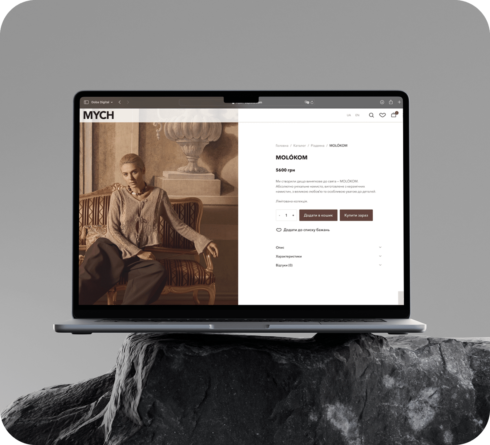
The MYCH website is designed as a minimalist platform for presenting object design. Its structure provides easy navigation between collections, detailed product overviews, and a simple ordering process — without unnecessary elements, with an emphasis on the product.
Collection catalog
Each collection is presented in a dedicated section with large visual blocks that convey its atmosphere and concept. The catalog's organization system allows for a smooth transition from the overall idea to specific items.

General product catalog
All products are presented in a spacious, minimalist grid, with a focus on the photos. The cards are kept light and casual, so that the user can evaluate the shape, material, and style before opening the page for a specific product.

Product page
Individual product pages are designed for detailed viewing: large photos, different angles, textures, materials, as well as a short history of creation. The information is structured for easy perception and does not interfere with the contemplation of visual elements.

Ordering
The purchase procedure is as simple and intuitive as possible: a few steps, a minimalist interface, and no unnecessary forms. This allows you to complete the purchase process quickly, while remaining in harmony with the brand's aesthetics.

Home page
The homepage is the first thing a visitor sees, so it should convey the brand’s mood and emphasize the level of your establishment from the very first seconds. Its main purpose is to create a strong emotional impression, while providing convenient and clear navigation: access to the menu, information about promotions, delivery options, table reservations, and contacts.


We designed the main page so that the user could immediately navigate the site structure, see the main offers and quickly proceed to order or reserve. Visual blocks, high-quality photos and expressive accents add dynamism to the page, while maintaining its lightness and simplicity.
Special attention was paid to the speed of the page and its optimization for smartphones, as most guests come from mobile devices. We took into account the need for adaptive design, placed convenient large clickable elements and ensured comfortable reading of texts to make it as convenient as possible for the user.
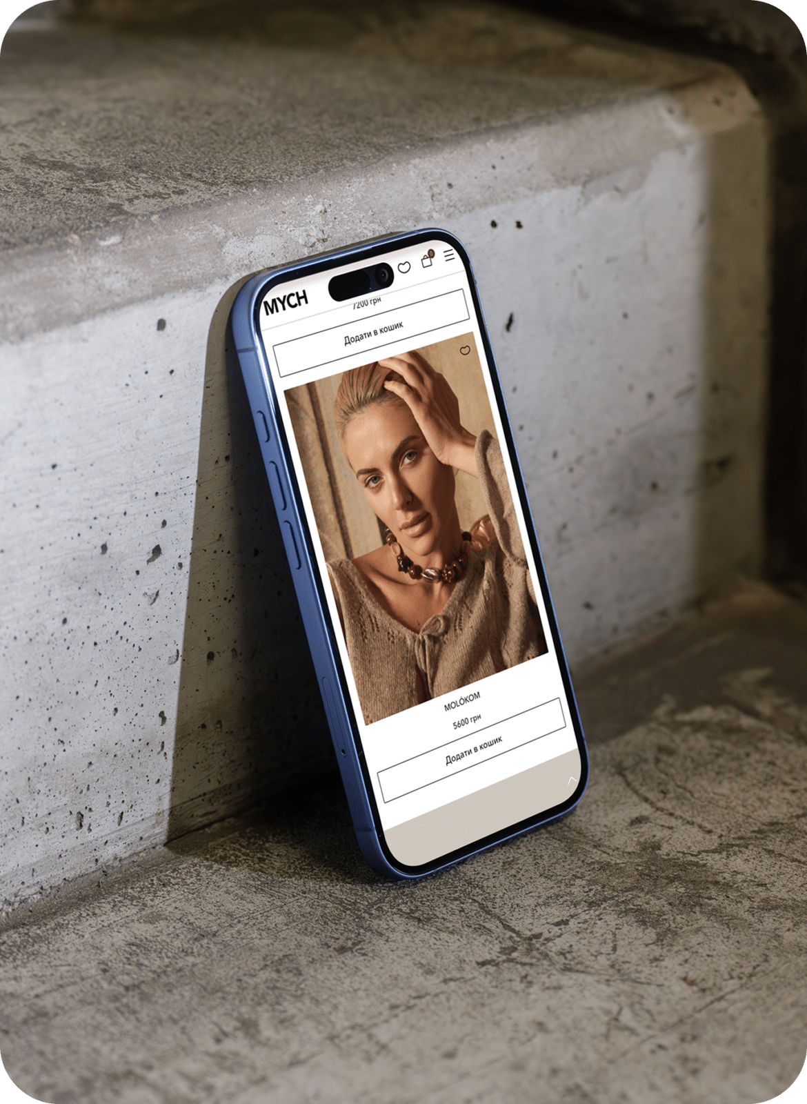
Mobile version
The mobile version of the MYCH website became one of the most important components of the project, as most users discover the brand through a smartphone. The main task was to create an adaptive design that would preserve the aesthetics of object art, minimalism and lightness that are characteristic of the brand.
-
Every component of the interface has been designed to avoid user overload: readable blocks with a sufficiently large structure, smooth transitions between sections, a logically organized collection structure, and convenient photo browsing. The site is devoid of unnecessary details, offering a calm and attentive interaction experience.
The mobile version not only adapts to different screen sizes, but also successfully conveys the brand's atmosphere, ensuring maximum comfort of use on any device. Users can easily navigate, find the right collection, view objects or make an application without any difficulties or distractions.


Frequently asked questions

Will we be able to update the collections ourselves?
Can the site be adapted to our aesthetics, colors, and photography style?
How long does it take to create a website for a subject brand?
Do I need to prepare photographic materials in advance?
Cases
How we help businesses grow
Blog
View all
November 26, 2025
Logoida Marian
Why a contract and discussion of details guarantee a good result
Most projects that reach a dead end have one thing in common…

October 26, 2025
Logoida Marian
When should you update your website design?
A website is not about the image, it’s about the experience. If the resource looks outdated…

October 25, 2025
Logoida Marian
What is a turnkey website and what results will you get?
The phrase "turnkey website" sounds appealing, but what does it mean? For owners…
Iryna Mych
Founder of the MYCH brand