


Development of a catalog website for the household chemicals brand iGel
Share with AI:
iGel is a premium Ukrainian brand of household chemicals from the manufacturer PR GROUP. The Doba Digital team was tasked with creating a website-catalog that would match the brand's level, become its digital continuation, and help present products through modern design, 3D, and interactive interaction. The result was a project that combined technological sophistication, premium visual presentation, and the team's own developments — from the first concept to the final launch.
View websiteCase iGel in 23 seconds
A brief overview of the finished site in a story format and feedback on the work.
Customer feedback
Click to watch full screen with sound
About the project
iGel is a Ukrainian household chemicals brand from PR GROUP, which focuses on modern design, product quality and its own production technologies. The main challenge was that at the start of the project we did not have physical samples of the products or professional photography. We only had 2D renderings, labels and the brand logo, so all the visual content had to be created from scratch. We implemented turnkey catalog website development: created custom 3D models, seamless animations, and a premium website-catalog for the brand, which became a full-fledged digital extension of iGel.
Goals and objectives
-

create a premium brand-level catalog website
-
create a wow effect from the first seconds
-
present the product and its benefits
-
implement a turnkey project with one team
-
create custom 3D models and seamless animations
-
ensure interactive user interaction with the product


We will create a website-catalog for your brand
If you are planning to launch a new product or update the digital presentation of an existing brand, the Doba Digital team will implement the creation of a turnkey catalog website. We take on the entire cycle of work: research, UX/UI design, 3D modeling, animation, programming, content, testing and launch. As a result, you get a digital product that helps the brand look stronger, more modern and more convincing to customers and partners.


What was implemented
Interactive 3D product presentation
The central screen of the site was an interactive 3D presentation built on custom product models created specifically for the project without ready-made libraries. The user himself controls the viewing scenario, switching stages forward or backward, so he can carefully examine the packaging, its shape, transparency of the plastic, liquid and structural details almost as if he were already holding the product in his hands. Seamless animations smoothly transition from one to another without launch buttons, turning the viewing into a single story. It is this interaction that increases the time on the site, more deeply engages the user and makes the project fundamentally different from competitors.

Catalog by category
All products are grouped into six categories, so the user can quickly find the right type of product and go to a specific product without unnecessary steps. We have built the catalog structure so that navigation remains clear even with a large volume of products: clear categories, predictable transitions and a logical path from the general overview to a single product. This approach is equally convenient for the end user and for brand partners who are navigating the assortment and looking for specific items.

Product page with specifications
A separate page has been created for each product, which contains all the necessary information about the product: a detailed description, available flavors, volumes, number of units in the package and technical specifications. An interactive 3D model of a specific product works alongside the description, so the user can simultaneously see both the data and the product itself in detail. This page format helps to quickly navigate the line, compare options and form a complete picture of the product before purchasing it in a store or from partners.

"Innovations" section«
A separate section is dedicated to the brand's innovations - the approach to formulas, technologies and product quality. Here we presented a complex technical topic clearly: through visual accents, animation and concise texts, so that the user can easily understand how iGel products differ from the usual household chemicals. This section reinforces the brand's positioning as technological: we deliberately showed household chemicals in the way modern gadgets are usually presented - this is what creates a feeling of premiumness and trust in the product.

Brand news section
To support active brand communication, we implemented a news section in the format of a card feed with a date, title and a short announcement. Here, iGel shares new product launches, participation in industry events and expansion of presence in retail chains. The section shows that the brand is alive and developing, and also works for organic promotion: regular publications give search engines fresh content and additional pages for indexing.

Results
The project for iGel became an example of how a modern catalog website can work not only as a source of information, but also as a full-fledged tool for presenting a brand. The combination of custom 3D, seamless animations and premium design allowed us to create a digital product that causes a wow effect from the first seconds of interaction. The site helps to build trust in the brand, emphasizes its technological capabilities and product quality without unnecessary explanations.
It is worth noting that the entire project — from UX/UI design and 3D modeling to animations, texts and programming — was implemented by one Doba Digital team without third-party contractors, which ensured uniform quality standards and full control over every detail from the first concept to launch. The project has a special value for partners, distributors and retail chains. During negotiations or a presentation of the assortment, the site allows you to quickly demonstrate the product, its advantages and brand level without additional materials.
It has become a full-fledged digital communication tool that supports the company's image and creates the right first impression even before the product is personally introduced. In addition, the project laid a solid foundation for the further development of the brand's digital presence and its scaling. It is also important that the main goal was not to directly generate sales, but to build a strong image: the site works as an extension of the brand, which builds trust in it even before the product is introduced to the store shelf.
Home page
The home page is built as a continuous scenario of getting to know the brand. Already on the first screen, the user is greeted by a large-scale animated 3D product presentation, which immediately demonstrates the level of the project and sets the emotional tone for the entire interaction. We deliberately abandoned a large amount of text at the start, placing the main emphasis on movement, details and smooth changes of scenes. Thanks to this, the visitor does not just browse information, but gradually immerses himself in the history of the brand.


After the first screen, the user is introduced to the main product categories, the brand philosophy, its approach to production, and the "Innovations" section. Separate blocks are dedicated to company news and the "Where to Buy" page, where you can find official partners and retail chains. Smooth animations unite all sections into a single scenario, so the main page is perceived as a modern product presentation, rather than a set of separate information blocks. This structure helps to keep the user longer and gradually lead them to a deeper acquaintance with the assortment.
Internal pages
The structure of the internal pages is built around the logic of getting to know the products. The catalog is divided into six categories, which allows you to quickly find the type of product you need and go to a specific product without unnecessary transitions.
This approach simplifies navigation and makes browsing the catalog clear for both the end user and brand partners who are already familiar with the range. Each product has a separate page with a detailed description, characteristics, flavors, available volumes, number of units in a package and an interactive 3D presentation. The pages "About us", "Innovations", "News", "Contacts" and service sections have also been implemented.
The entire structure is designed so that the user naturally moves from learning about the category to a specific product, and then to the «Where to Buy» page or feedback form. This keeps even a large volume of products structured and easy to understand.


Mobile version
The mobile version of the project was created simultaneously with the desktop version, so all interaction scenarios were thought out at the design stage. We didn't just adapt the ready-made interface, but separately optimized it for touch control, preserving the smoothness of animations and speed of operation even on compact screens.
-
Special attention was paid to the interactive 3D presentation, which fully supports touch control. The user can view products, switch presentation stages, familiarize themselves with the characteristics, go to the "Where to buy" page, or leave a request without unnecessary actions.
By optimizing graphics, animations, and page structure, the mobile version provides the same level of experience as the desktop version. This is especially important, as a significant portion of the audience gets to know the product from a smartphone, so preserving full functionality and animation quality on mobile devices was one of the project’s priorities.


Хочете схожий сайт?
Порахуйте орієнтовну вартість за хвилину — 4 питання, без реєстрації.
Frequently asked questions

How does a catalog website differ from an online store?
How long does it take to develop a catalog website?
Can you create 3D models and animations without product photos?
Do you implement turnkey projects?
Cases
How we help businesses grow
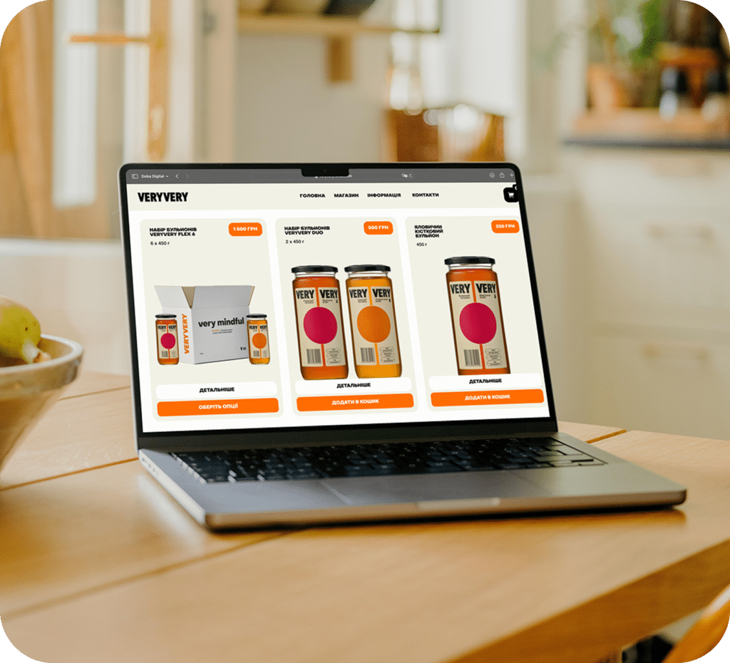
Online store development for VERYVERY
This is a Ukrainian brand of natural broths with collagen. The site was supposed to combine the functions of an online store, a culinary space, and a platform for introducing new customers to the product.

Catalog website redesign for PR Group
PR Group is a Ukrainian manufacturer of full-cycle household chemicals with a portfolio of five brands. The Doba Digital team was tasked with redesigning the company's website - a corporate catalog site that would correspond to the manufacturer's level, reveal each brand in detail, and become a convenient tool for partners and distributors.

Website redesign for the SPA-hotel “Chervona Ruta”
SPA-hotel “Chervona Ruta” is a country recreation complex in Shayan, which has been welcoming guests from different parts of Ukraine and abroad for many years. The previous website no longer corresponded to the scale of the complex: the structure was confusing, some information lost its relevance, and it became increasingly difficult for users to quickly find the necessary services or proceed to booking.
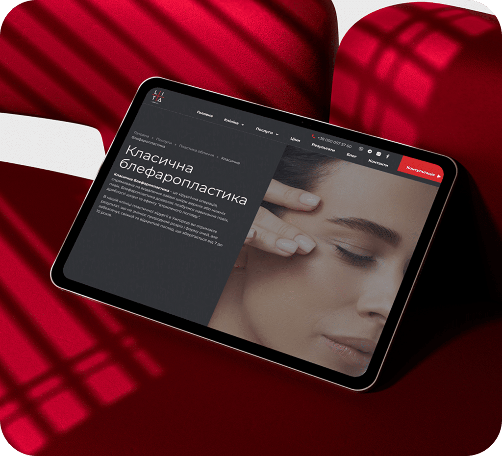
Corporate website development for LITA Plus
The LITA Plus website is designed as a convenient information resource that allows clients to easily find the necessary procedure, learn about doctors and their professional experience.

Online store development for MYCH
This is a Ukrainian brand of functional art that manually creates unique objects and interior solutions from natural materials, embodying the philosophy of quiet luxury.
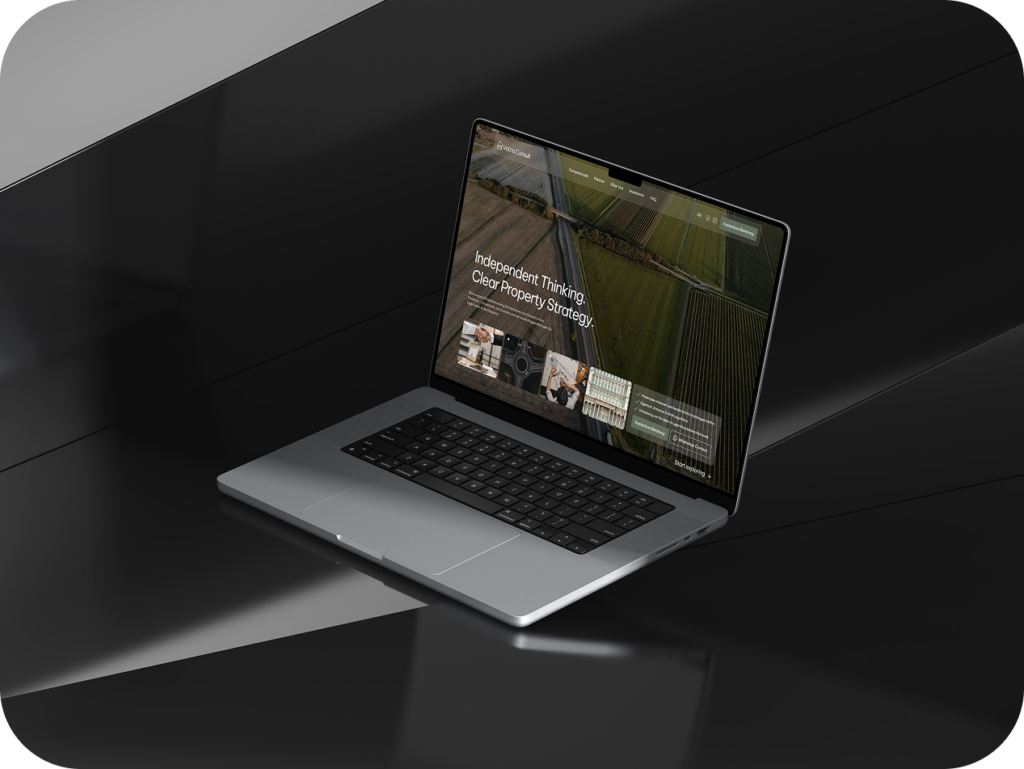
Landing page development for Vatria Consult
Vatria Consult is a consulting company that helps owners of real estate and land plots in Romania who live abroad, in the diaspora. The Doba Digital team was tasked with developing a turnkey multilingual landing page that would convey the reliability and structure of the service and lead the user to a free consultation. In addition to the website itself, we prepared a mini-brand identity for the client.
Blog
View all

November 26, 2025

Logoida Marian
Why a contract and discussion of details guarantee a good result
Most projects that reach a dead end have one thing in common…

October 26, 2025
Logoida Marian
When to Update Your Website Design: 7 Signs It's Time to Redesign
The site is aging imperceptibly. It works, applications sometimes come in, but the client…

October 25, 2025
Logoida Marian
What is a turnkey website and what results will you get?
The phrase "turnkey website" sounds appealing, but what does it mean? For owners…

Vadym Didoruk
Sales Director
When we were choosing a team to create the iGEL brand website, it was important for us to find people who would truly understand our brand. And today I can say that we made the right choice. The Doba Digital team didn’t just create a website. They conveyed our idea, character and values of our brand.
When we were choosing a team to create the iGEL brand website, it was important for us to find people who would truly understand our brand. And today I can say that we made the right choice. The Doba Digital team didn’t just create a website. They conveyed our idea, character and values of our brand.