


Website redesign for PlusMed medical center
Share with AI:
PlusMed is a medical center in Uzhhorod that combines reproductive medicine, gynecology, pediatrics, and seven other medical specialties in one space. The Doba Digital team was tasked with redesigning the clinic’s website — to streamline the structure of specialties and doctors, and to make making an appointment as simple as possible. We performed the redesign as a separate website design service: new information architecture, UX/UI of all key pages, and an adaptive design system. The development and implementation into code is performed by the client’s technical partner.
View websiteCase PlusMed in 23 seconds
A brief overview of the finished site design in stories format and feedback on the work.
I want a site like thisClick to watch full screen with sound
About the project
PlusMed is a medical center in Uzhhorod with two specialized departments: Reproductive and Allergology Centers. Over the past 10 years, the clinic has helped more than 46,000 patients, and the team includes 20+ specialists in ten areas - from reproductive medicine, gynecology and pediatrics to endocrinology, cosmetology, urology and family medicine. The previous website did not keep up with the real scale of services: information about areas and doctors was scattered across the pages, and the path to an appointment was confusing.
Doba.Digital was solely responsible for the design — this is a separate service for clients who already have a developer or technical partner. The client provided the facts about the clinic, doctors, and services, and we were responsible for the structure, UX/UI, and visual system of all key pages of the site.
Goals and objectives
-

build a clear site structure with navigation by directions and doctors
-
increase visitor trust through clinic metrics and specialist profiles
-
simplify the path to making an appointment from multiple points on the site
-
prepare an adaptive design system ready for transfer to development
-
execute the project as a point design service — without layout and programming


Order a website design for your business
If you need a well-thought-out UX/UI without any development, the Doba Digital team will help. You can order website design as a separate service: we analyze the structure, design all key pages, and prepare a design system that is easy to transfer to any developer. Suitable for both a complete redesign of a multi-page website and for individual sections when the rest of the site is already satisfactory.


What was implemented
Home page
The homepage is built as a consistent presentation of the clinic: a short first screen with a registration button, a block of key indicators (10+ years of work, 46,000+ patients, 20+ specialists, 2 departments), a visual grid of all directions, doctors' cards with photos and a registration button right from the homepage, a block of clinic advantages (qualified specialists, modern equipment, convenient online registration, state infertility treatment program) and a final CTA. The page is closed by a block of the latest blog posts, which works both for SEO and for the visitor's trust.

Directions and the direction page
The «Directions» page provides a detailed list of services in the form of cards with icons, and each direction has its own detailed page - for example, «Gynecology» with a description of services, pregnancy management, Astraia prenatal screening and fetal cardiotocography. This level of detail is important for medical topics: the patient understands what exactly is included in the service even before calling the clinic, and does not find out at the reception.

Doctors
The «Our Doctors» page shows the center’s specialists with cards with photos, specialization, and filtering by direction — you can find the right doctor among 20+ specialists in a few seconds, instead of scrolling through the entire list. The doctor’s individual page is supplemented with education, certificates, and an appointment form directly from the page, without going anywhere else.

Prices, publications and reviews
The «Prices» page structures the price list of services by direction — convenient for scanning a large list of items without confusion between departments. The «Publications» section and a separate article template work for the clinic’s blog, and the «Reviews» page shows real patient reviews in a format that is easy to scale without reordering when there are more reviews.

Patients and contacts
The "For Patients" page provides reference information for those preparing for a visit — documents, preparation for the appointment, organizational details. "Contacts" shows both clinic addresses — the Reproductive and Allergy Centers — with a map and contact form, since the departments are spread out across the city.

Results
As a result, the client received not just an updated «picture» of the main page, but a full-fledged site structure: logical navigation by directions and doctors, a single visual language for all pages, and a component system that is convenient for layout. The main problem that PlusMed came to Doba.Digital with — scattered information about directions and doctors and a confusing path to an appointment — was solved at the design level: each direction, doctor, and service has its own clear page, and appointments are available from several key points on the site.
This applies in particular to the reproductive medicine area and the state infertility treatment program: previously this information was lost among other services, now it is prominently displayed on the main page. The two departments of the clinic — the Reproductive Medicine and Allergy Centers — are also transparently separated at the contact and navigation levels. And thanks to a single design system, the clinic will be able to add new doctors, areas, or publications without violating the visual integrity of the site.
Since Doba.Digital was solely responsible for the design, some sections are already working on the live plusmed.ua website, while others are still waiting to be coded by the client's technical partner. This format of cooperation is suitable for companies that already have their own technical team and only need a high-quality UX/UI solution - this is exactly what we offer as a separate service: website design for your needs, without being tied to your own development.
Home page
We built the main page as a consistent presentation of the clinic — from the first screen with a brief description of PlusMed’s mission and the button to make an appointment to a detailed picture of the team and areas of work. Immediately below the header, we placed a block of key indicators of the center: 10+ years of work, 46,000+ patients, 20+ specialists, 2 specialized departments. For medical topics, this is a critically important block — a patient who chooses a clinic for infertility treatment or pregnancy management is looking for confirmation of experience even before he starts reading about specific services.


Next comes the «Our Areas» block with a visual grid of all the clinic’s areas: reproductive medicine, gynecology, pediatrics, endocrinology, cosmetology, dermatovenereology, allergology/immunology, urology, ultrasound, and family medicine. Each area is a separate card with an icon and a link to a detailed page, so the user immediately sees the full range of services, rather than guessing about it from a drop-down menu. This approach is especially important for the clinic’s reproductive medicine area — that’s where most of the requests, including those related to the state infertility treatment program, lead, so we placed it in a prominent place on the main page, rather than hiding it in a subsection. The «Our Doctors» block shows the center’s specialists with cards with photos, specializations, and a registration button — a direct bridge to conversion right from the main page, without having to go to a separate page.
Below is a block of clinic benefits (qualified specialists with international certificates, modern diagnostic equipment, convenient online registration, state infertility treatment program without leaving the region) and a final CTA with a repeated invitation to make an appointment. The block of the latest blog posts closes the page, working simultaneously on SEO and on the visitor's trust. The color scheme of the design is the branded dark blue PlusMed in combination with a light background and blue accents on the buttons: a solution that reads as medical, but not "cold" or soulless. Typography and iconography are designed in the same style on all blocks so that the main page does not fall apart into separate, visually unrelated sections.
Internal pages
All pages on the site—from directions and doctors to pricing, publications, reviews, and contact—use the same visual system: fonts, colors, card components, and buttons. So the transition between sections feels cohesive, rather than a collection of disparate templates that have simply been thrown together.
Each screen is designed as part of a system: what the user sees first, where each button leads, and how the page behaves with more or less data — for example, when there are more doctors or specialties in the clinic, and the list of prices or publications grows. Special attention is paid to the specialty pages: each of them is designed as an independent landing page with its own title, description of the service, and a team of doctors in this specialty.
For a clinic with ten areas of work, this is not just convenience for the visitor, but also the basis for further promotion of each area separately, when the client moves on to filling the site with content.


Mobile version
We did not prepare separate mobile mockups for PlusMed: the client independently adapts the design to different screens with the help of its technical partner. Therefore, at the design stage, we relied on a transparent modular structure.
-
The cards for directions, doctors, prices, and publications are built on the same repeating components with a clear hierarchy of elements (headline → key information → action), which simplifies responsive layout without losing page logic even without separate mobile layouts at hand.
Part of the updated design is already visible on the live plusmed.ua website, including correct display on mobile devices, although not all sections have yet been migrated to the current version of the site. When the client completes the implementation of the remaining pages, the case will be supplemented with screenshots of the finished mobile version of the site.


Хочете схожий сайт?
Порахуйте орієнтовну вартість за хвилину — 4 питання, без реєстрації.
Frequently asked questions

Can I order only website design from Doba.Digital, without development?
How is a website redesign different from developing a new website from scratch?
How long does a website redesign take?
Who is responsible for implementing the design into code after a redesign?
Cases
How we help businesses grow

Catalog website development for iGel
iGel is a premium Ukrainian brand of household chemicals from the manufacturer PR GROUP. The Doba Digital team was tasked with creating a website-catalog that would match the brand's level, become its digital continuation, and help present products through modern design, 3D, and interactive interaction.
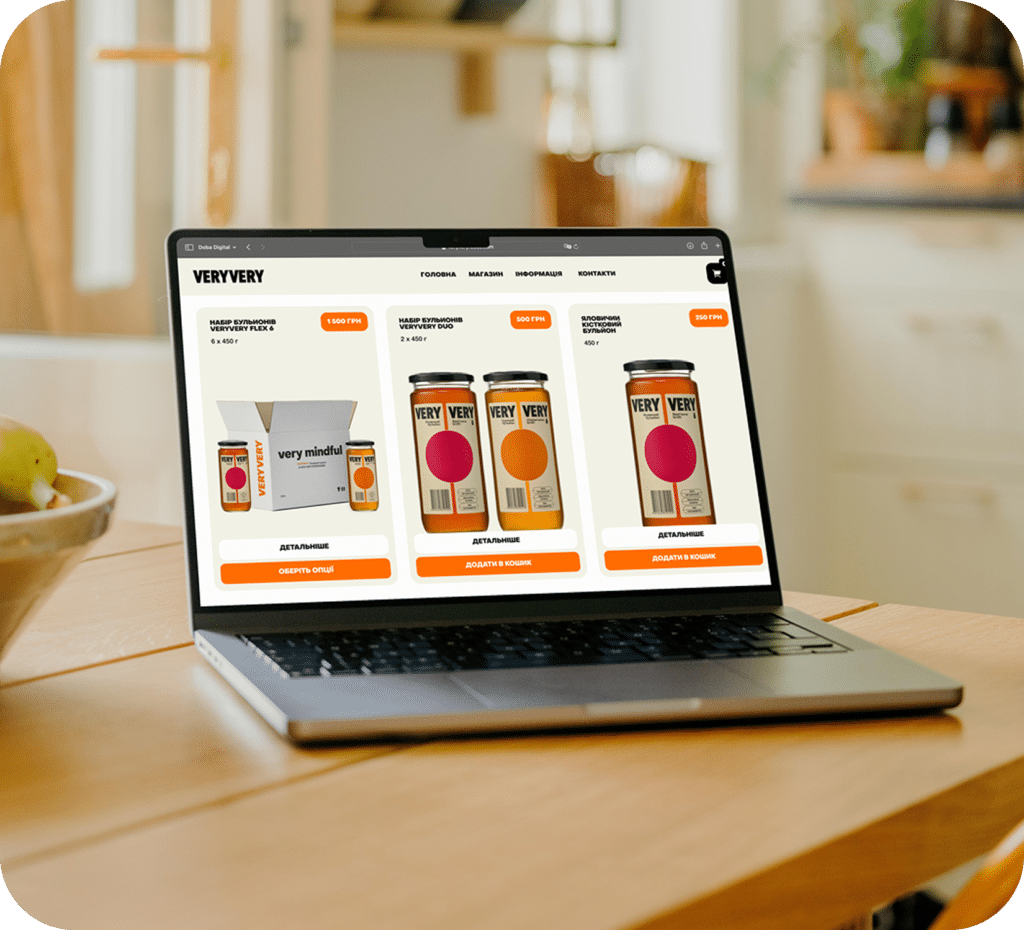
Online store development for VERYVERY
This is a Ukrainian brand of natural broths with collagen. The site was supposed to combine the functions of an online store, a culinary space, and a platform for introducing new customers to the product.

Catalog website redesign for PR Group
PR Group is a Ukrainian manufacturer of full-cycle household chemicals with a portfolio of five brands. The Doba Digital team was tasked with redesigning the company's website - a corporate catalog site that would correspond to the manufacturer's level, reveal each brand in detail, and become a convenient tool for partners and distributors.

Website redesign for the SPA-hotel “Chervona Ruta”
SPA-hotel “Chervona Ruta” is a country recreation complex in Shayan, which has been welcoming guests from different parts of Ukraine and abroad for many years. The previous website no longer corresponded to the scale of the complex: the structure was confusing, some information lost its relevance, and it became increasingly difficult for users to quickly find the necessary services or proceed to booking.
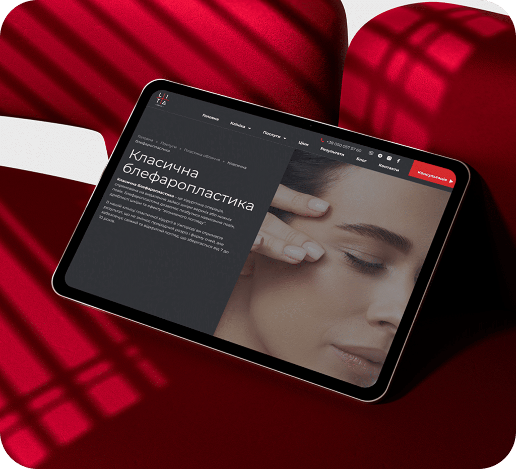
Corporate website development for LITA Plus
The LITA Plus website is designed as a convenient information resource that allows clients to easily find the necessary procedure, learn about doctors and their professional experience.

Online store development for MYCH
This is a Ukrainian brand of functional art that manually creates unique objects and interior solutions from natural materials, embodying the philosophy of quiet luxury.
Blog
View all

November 26, 2025

Logoida Marian
Why a contract and discussion of details guarantee a good result
Most projects that reach a dead end have one thing in common…

October 26, 2025
Logoida Marian
When to Update Your Website Design: 7 Signs It's Time to Redesign
The site is aging imperceptibly. It works, applications sometimes come in, but the client…

October 25, 2025
Logoida Marian
What is a turnkey website and what results will you get?
The phrase "turnkey website" sounds appealing, but what does it mean? For owners…
